The Importance of Color in Book Cover Design

Earlier this week we talked about How Not to Get Overwhelmed: The Book Cover Design, and I felt like something was missing. Yesterday I listened in on a webinar hosted by Joseph Michael and featuring Mike Balmaceda that discussed making your book cover the best it can be to sell your story. That’s when it dawned on me what I’d forgotten to add when we discussed cover design! Color! I wanted to give you one more bit of info whether you plan to design your own cover or commission one.

Colors Matter

I have always enjoyed the feel of colors, and any time I’ve asked for feedback on the various covers I’ve designed the response often comes with an emotional connection of some sort. There is something about colors that attract and repel us, and they also convey a sense of emotion, which as writers and indie publishers we need to be taking advantage of for our book covers.

Instead of me rambling on I wanted to share some infographics I have found helpful as I learn more about the psychology of color and work to use it more efficiently. I thought you might also find this info helpful for designing your own covers. If you are having someone else design the cover, it’s good to share the color scheme you’d like for your books with whoever might be designing it so that you best convey the feeling/emotion you want your readers to gain.

I’d also say that while you’re researching other covers in your genre that you pay attention to the color schemes, too!

entrepreneur.com
entrepreneur.com

The following chart is from CoverDesignStudio.com:

Red Energy, enthusiasm, emotion, power
Dark Red Passion, depth, dominance, prestige
Orange Positive, dynamic, optimistic, confident
Pale Yellow Friendly, approachable, warm
Bold Yellow Ambition, motivation, creativity, cutting edge
Green Nature, vitality, environment, health
Blue Dependability, trust, thoughtfulness, calm
Dark Blue Deep sincerity, intuition, truth
Light Purple prosperity, spirituality, creativity, harmony
Dark Purple Depth, wealth, mystery, fantasy
Grey Sophistication, knowledge, prestige, wisdom
Pink Youth, playfulness, emotion, innocence
White Clean, straightforward, self-sufficient, simple
Black Authority, power, control, mystery, suspense
Brown Natural, of the earth, comfortable, organic

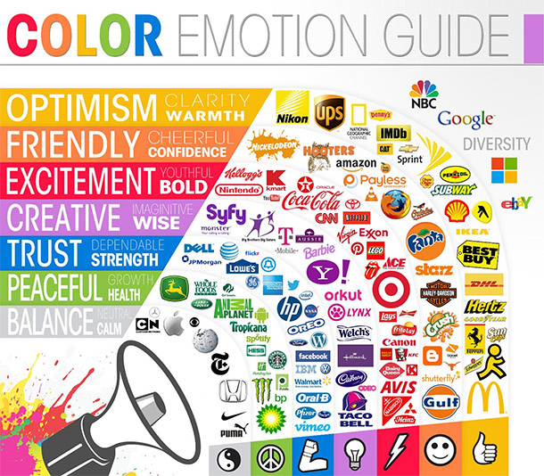
This next one I like to look at when thinking about branding and logos for author marketing type stuff.

entrepreneur.com
entrepreneur.com (this infographic no longer has an article, but you can check out a similar one: https://www.entrepreneur.com/growing-a-business/the-role-of-color-in-branding-infographic/286324 )

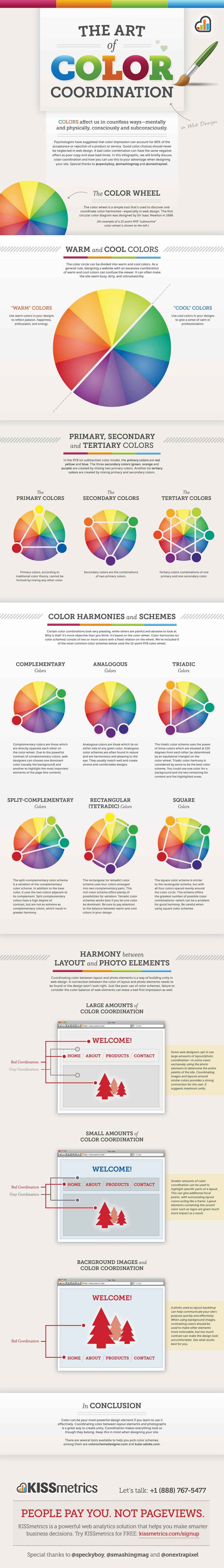
This last chart I added because I adore the simple and straightforward presentation of how primary, secondary, and tertiary colors correspond!

TheUltraLinx: http://theultralinx.com/2012/06/art-colour-coordination-infographic/

You can click on any of the images to see the infographics on the owners’ websites.

57 responses to “The Importance of Color in Book Cover Design”

  1. […] to the fascinating world of book cover design, where colors do more than just please the eye. They hold immense power to influence readers, evoke emotions, and […]

    Like

  2. […] to color theory and psychology, these color combinations are best for the children’s book cover […]

    Like

  3. Reblogged this on When Angels Fly and commented:
    Truly food for thought in this post. I design all my own book covers and I feel confident that I made the right choices.

    Liked by 1 person

  4. […] via The Importance of Color in Book Cover Design — Fiction by Rachael Ritchey […]

    Like

  5. Colour is sooo important when it comes to design – I remember spending ages learning about it at uni (I did an Applied Arts Degree), and the way that people use colour within their businesses to evoke an emotional response – book covers are no different. Lots of useful info here 🙂

    Liked by 2 people

    1. That is great, Helen. You’ve already got a background in this. Do you have any other thoughts or advice to add?

      Liked by 1 person

      1. Thanks, Rachael. I think the infographics you have here cover the main aspects of using colour – less is more, opposite colours vibrate, co-ordinate colours if possible, use colour to set the mood. For my book covers, I wanted them to have more of an antique feel, so I chose colours that were slightly faded, like old leather bindings. So there’s that to consider as well, I guess 🙂

        Liked by 1 person

        1. That’s great advice, Helen! Thanks for sharing that. 🙂

          Liked by 1 person

          1. Thanks, Rachael – you’re very welcome 🙂

            Liked by 1 person

  6. Wonderful post thank you. It will be going into my library bookmark as with all of your indie overwhelmed posts as they are so intrinsic to our craft.

    Liked by 1 person

    1. Thanks, Adele. I’m sho glad to be sharing helpful info!

      Liked by 1 person

      1. Your advice really helps.

        Liked by 1 person

  7. phoenixgrey85 Avatar

    Another useful post. 🙂 Colour intimidates me. There, I said it. I’ve tried designing small things in the past, and freaked out at now knowing what colours will go together, or what looks right or anything. But the above could be useful in facing that particular fear. Thank you. 🙂

    Liked by 1 person

    1. I think the color wheels that show the primary, secondary, and tertiary colors that compliment each other is the best place to start. Don’t worry so much about the moods besides how those combinations affect your perception of what you’ve made. Colors are friends not food…oh wait, that’s fish. Fish are friends not food. No…fish are definitely food. Nevermind. Just use color! 🙂

      Liked by 1 person

      1. phoenixgrey85 Avatar

        Fish can be friends and food. Though that can be confusing. But colour isn’t food.
        Will use colour. Or try. 😀

        Liked by 1 person

  8. Those are great. The first one really cracked me up. Hugs!

    Liked by 1 person

    1. A little humor to the process keeps the head from exploding. 😉 Thanks, Teagan!

      Like

  9. This is fabulous and just what I needed! Thank you for sharing this Rachael. 🙂 There is so much learning involved when it comes to using colors well. I’m trying to learn this now.

    Liked by 1 person

    1. Me, too. I already know what works for me, and studying this information explains a lot about why I see certain combinations working and others not. 🙂

      Liked by 1 person

  10. I love this!
    ❤️💛💚💙💜

    Liked by 1 person

  11. Great post. I’ve learnt a lot. Now following you..All the best. Kris.

    https:///awritersden.wordpress.com/
    https://1951club.wordpress.com/

    Like

  12. Reblogged this on Don Massenzio's Blog and commented:
    Here is a great post on the subject of color use in book cover design

    Liked by 1 person

  13. […] * 5/12/16 I forgot to add any info about the importance of color in book cover design, so here is a link to an additional bit of info on my blog, just in case: The Importance of Color in Book Cover Design […]

    Like

  14. Wow-za, Rachael. Undeniably illuminating. Thank YOU. 🙂

    Liked by 1 person

    1. 🙂 I live to serve up so much info everyone’s brains explode. Errr…ummm..I mean, I live to serve…? 😉

      Like

  15. Oh heck…this has hit me where it hurts….arty book cover stuff….I write, no do art 🤕

    And yet I know the cover is a make or break thingamy that cannot be avoided….I think I best dig deeper into your posts on this 😢

    Liked by 1 person

    1. It hurts me, too, Gary and I’m even a bit artsy. I feel like I’m still on a learning curve here with this subject in particular since the cover is sooooo important. I have a feeling as I write this series my design sense will evolve and I’ll find I REALLY need new covers for the series. Since you have to get a new ISBN for print books with new covers that could mean serious expense later. I guess it’s best to get a great cover FIRST so you don’t have to go back and do that later. You know?

      Liked by 1 person

      1. Yes, not even thought about ISBN yet….book, proofer, synopsis, blurb, cover then decision…agent or self publish….I’m at the synopsis point…but chose to prevaricate and do some blog posts instead starting with the five word challenge 🙃

        Liked by 1 person

        1. nothing wrong with a little prevarication when the overwhelming feelings set in. Take a break and come back to it. 🙂

          Liked by 1 person

          1. I am and the solution to surfer has presented itself….but book covers is fingers in ears, eyes shut tight and la la la chanting 🙃

            Liked by 1 person

            1. 😀 I find myself smiling at both. Haha

              Liked by 1 person

            2. No pressure then…don’t go expecting too much 🙃

              On either front 🤔

              Liked by 1 person

            3. Okay. I’m sure I’ll enjoy the read just like chatting with you.

              Liked by 1 person

            4. Odd you say that because I think my narrative voice gets ‘chatty’ in its wordcraft…rightly or wrongly 🙃

              Liked by 1 person

            5. Haha maybe it ‘keeps it real!’

              Liked by 1 person

            6. Shoot there’s real and real….I think I do chatty narrative just to make sure I don’t spook myself out…no idea if it works for readers that way though 🤔

              Liked by 1 person

            7. Curious thought. Well have to see.

              Liked by 1 person

            8. Hopefully tomorrow for that piece I was mucking about with then 😊

              Liked by 1 person

            9. Really? 😀 Cool! Will just get on the computer to read. 🙂

              Liked by 1 person

            10. Err….no rush…it’s…nothing more than a ramble…expect nothing too inspiring 😁

              Liked by 1 person

      2. and yet your book covers are stunning. Can I ask how you did them?

        Liked by 1 person

        1. Thanks, Jen! I make them using PaintShop Pro. I use my own photography and lots of photo manipulation in the program. Not sure I’d that’s helpful info, but if you have other questions, please ask. 🙂

          Liked by 1 person

          1. Not tried PaintShop Pro. Hope its not expensive!

            Liked by 1 person

            1. I have an old version, but I checked their website. Pro8 is the current version and the base program is $79.99, but currently discounted to 63.99. Not cheap, but if you use it a lot, it is worth it. If you don’t think you’ll spend a lot of time or aren’t comfortable with designing it might not be worth it, but something to consider.

              Liked by 1 person

            2. I might have to try the free trial first, if its too technical it won’t help my sanity levels!

              Liked by 1 person

            3. That I totally understand!

              Liked by 1 person

Please leave a comment, question, or idea! I’d love to chat!

This site uses Akismet to reduce spam. Learn how your comment data is processed.

Create a website or blog at WordPress.com